4 Tips To Optimize Your Website Navigation Experience
Tips
July 7, 2022
Planning a website navigation may seem like a simple enough task, however, there are many things to consider when formulating a navigation plan - whether you are re-designing or re-structuring an existing navigation, or planning a navigation for a brand new website.

Understanding the importance of your navigation
Before you can redesign your navigation, it is fundamental to understand the role that a navigation plays in relation to your website.
What is the purpose of your navigation?
As the term suggests, your navigation is the roadmap that users will use to guide them through your website content, allowing them to find their way around your website and to their desired destination. Your navigation may take on different styles depending on the needs and motivations of your users, the amount of content your site has, and the goals of your organization.
The following examples highlight some of the popular approaches to navigation.
A straight path to most (if not all) of your pages
Facilitated exploration of content based on areas of interest or curated recommendations
A structural hierarchy, with clear paths to topically organized and nested content
Or a combination of some or all of the above
How you determine which type of navigation is best for your website, is dependant on the type and amount of content you have, the motivations of your users, and your overall business goals.
Is your navigation a direct representation of your websites sitemap?
Not necessarily. Your navigation can, but does not need to, coincide with your site structure or sitemap. It also does not need to coincide with how your organization internally structures itself (in fact, it probably shouldn't). What it needs to do is follow consistent patterns of user behaviour and expectation, decreasing friction, ambiguity or hesitation at every step.
Tips to facilitate actions, reduce friction, and improve experience
In order to create a seamless experience for your users, there are best practices you want to follow for crucial areas when planning your website navigation. We have broken these down into the following categories:
Create clear labels for navigation options
Organize and structure content
Create clear and specific calls-to-action
Optimize the number of items in your navigation
Create clear labels for navigation options
The naming of your navigation items should be intuitive for all users, whether they are familiar with your business and its industry or not. These terms should accurately represent the content that a user will find if they select that navigation item (whether the interaction is a drop-down for more granular options, or leads users directly to a specific page and content).
Industry specific terms or playful nomenclature have no place here. When it comes to terminology, any risk of misinterpretation should be avoided, as it could be the difference between a successful interaction and drop-off. Users are far less likely to click on an item if they are not confident that they know what the result will be. Finally, keep navigation terminology short and concise for each item - this will keep your navigation choices clear, easy to scan and compare if needed.
Organize and structure content
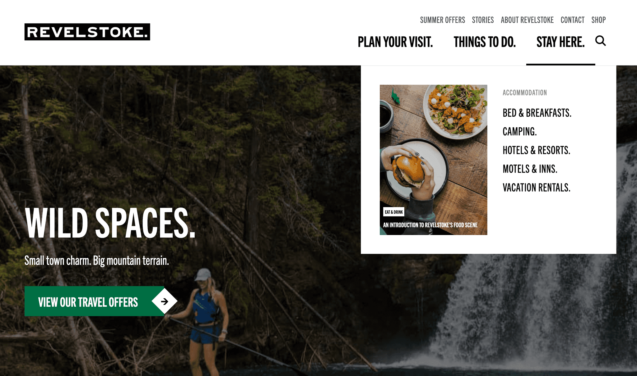
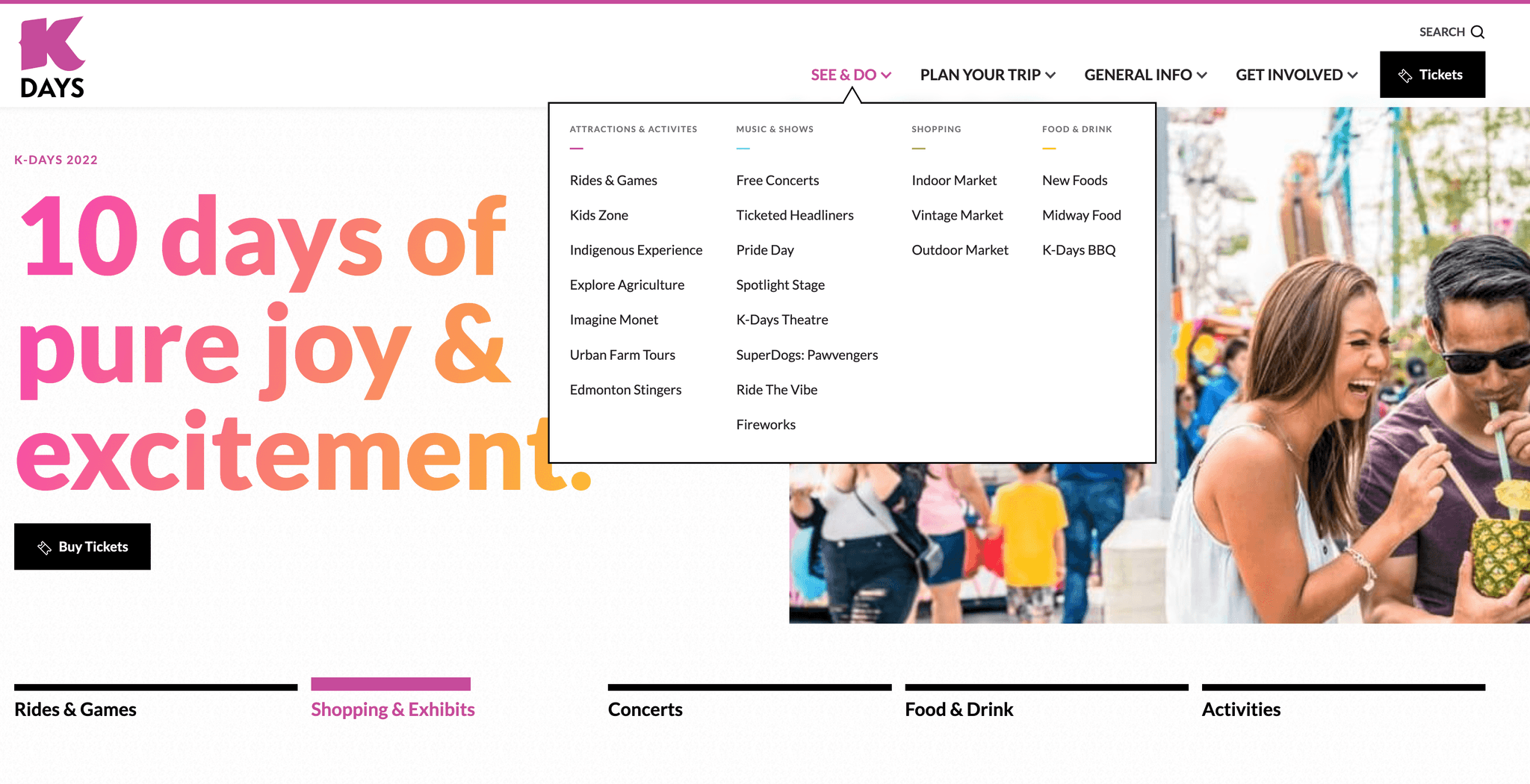
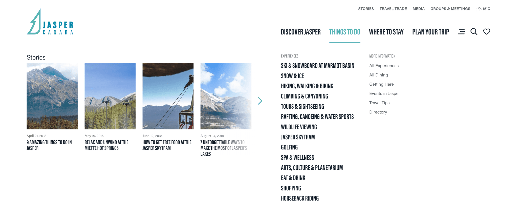
For complex content, drop-down navigations are helpful for users as they provide a comprehensive list of all options. These navigations provide a direct path from one page (potentially deep in the website), to another page (equally deep) in the site. Options should be grouped and organized with just as much consideration as was put into selecting the right terminology. Users look for information in proximity to like information, and default to learned patterns and behaviour.
The number and order of your navigation items is another important consideration. Too many options without contextual grouping can be overwhelming. Break options into small, easily scannable groups. Alphabetical listing of options tends to be the most intuitive for all users, especially for those unfamiliar with the content.
Create clear calls-to-action (CTAs)
Whether you include a call-to-action (CTA) in your main navigation is dependent on what the main goal of your site is. If your objective is to gather lead generation or purchases, or to motivate your users to a different action (start a free trial, learn more), including a prominent CTA button in your navigation is key.
The location of this button should be consistent with best practice (oriented at the end of your navigation items, on the far right side). Again, we want to reduce friction at every step. Users expect to look at specific areas of a screen for certain elements, based on past experiences. When these expectations are not met, users can become disoriented or frustrated.
Optimize the number of items in your navigation
The general rule of thumb is between 4-5 items in your main navigation. This is not a hard and fast rule, and it has more to do with user behaviour than the overall design aesthetic (although, this too is should be considered). Based on the principle of the Serial Position Effect, the larger the number of options, the more difficult it is for a user to recall the options in the middle. Human attention is limited to maintaining about 5 items in our short term memory at any given time. If your navigation items require any sort of cognitive attention (or even if they do not) larger lists of options make it harder for a user to recall all of the options available to them. This is not helpful, and could result in the user having to re-read navigation options, potentially causing confusion or frustration.
The position and order of these options is also important. Your main goal or the most important information for a user should be listed first in the navigation, or last as the primary call to action. Based on the Serial Position Effect, users are most likely to remember the FIRST item in a list and/or the LAST item in a list. So if we want to lead users to specific content, these navigation items are going to be the ones they recall best.
Go forth and navigate!
Congratulations, you are now equipped with some of the thinking needed to need to plan the best navigation for your content and your users. Get out there and make experiences that are so fluid that your work becomes literally un-noticed by users.